Commo — Multi-Service Booking Platform
Overview
As the Lead Product Designer for Commo, I designed a complete two-sided platform that connects users with local service providers — including car washes, beauty professionals, pet care, cleaning services, fitness instructors, and more. The ecosystem includes:
A mobile app for users
A mobile app for service providers
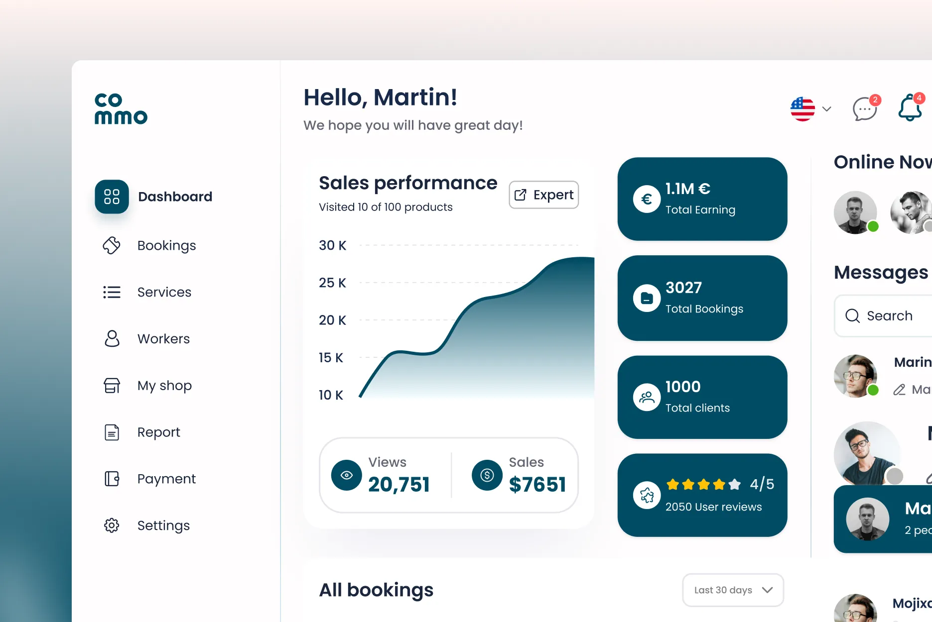
A complete web dashboard for providers
A web module for users
A shared design system built in Figma using components, auto-layout, variants, interactive states, and token-based styling.
My responsibility spanned the entire product lifecycle — from user research and journey mapping to prototype testing, multi-module UI design, and integration flows supporting Stripe, real-time booking, staff management, notifications, multi-currency, and multi-language support.
The goal was to build a seamless, trustworthy, and easy-to-use platform that helps users discover services, compare deals, and book appointments effortlessly, while giving providers the tools to manage their business digitally.
[ Key Features ]
User Module (Mobile App & Web App)
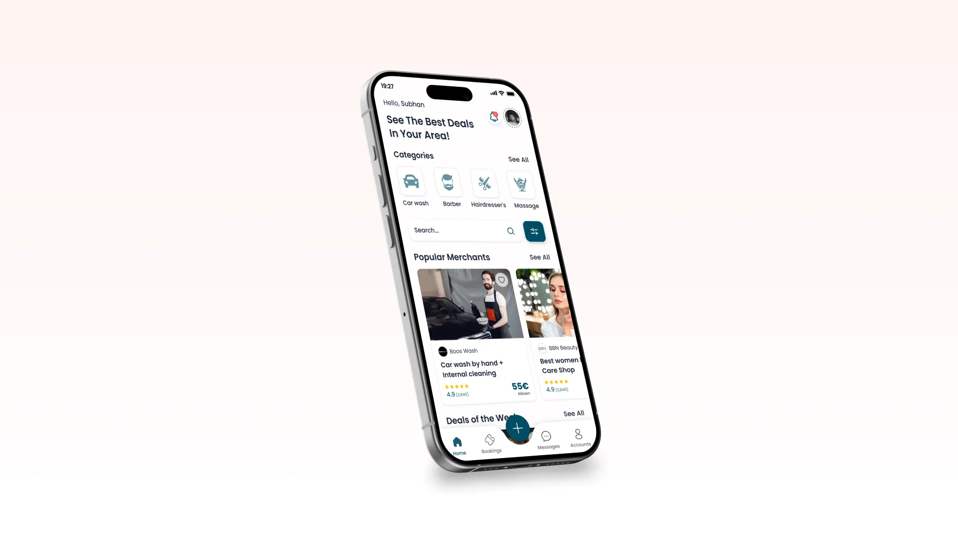
Service Discovery Feed – A personalized homepage showing deals, categories, popular merchants, and recommended services.
Multi-step Booking Flow – Variation selection → services → professional selection → date & time → details → payment.
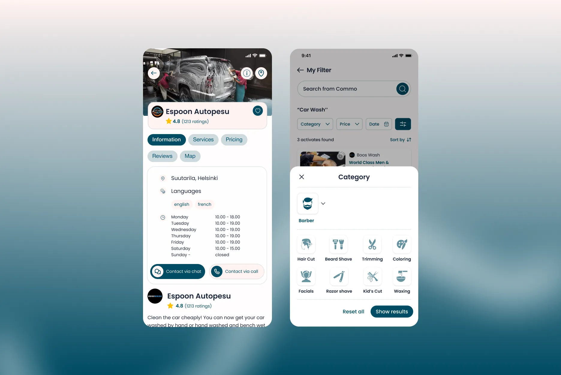
Provider Mini-Website – Each provider gets a branded microsite with services, pricing, reviews, and map integration.
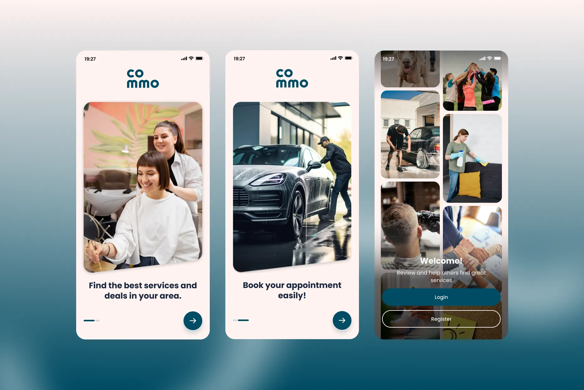
Secure Authentication – Email, phone, Google, Facebook, and Apple sign-in.
Notifications – Booking updates, discounts, promotional messages, and review reminders.
Provider Module (Mobile App & Web Dashboard)
Earnings Dashboard – Total earnings, sales graphs, bookings, and clients overview.
Staff Management – Add/edit professionals, availability slots, and service assignments.
Booking Management – Accept, reject, modify, and contact users.
Pricing Management – Edit service packages, variants, and add-ons.
Review Management – Reply to customer reviews, manage ratings, and maintain reputation.
Global Platform Features
Integrated Stripe payments
Multi-currency & multi-language support
End-to-end booking tracking
Real-time availability syncing
Smart service recommendations
Interactive map views
[My Role & Process]
Research
I conducted user interviews with:
Everyday customers booking services
Car wash owners
Barbers and beauty specialists
Home cleaners and fitness professionals
Key insights:
Users wanted transparency (pricing, timing, reviews).
Providers needed a simple interface to manage bookings.
Many users abandoned service booking apps due to complex checkouts.
Providers relied on WhatsApp for bookings — causing confusion and double-bookings.
These insights influenced the multi-step guided booking flow and the clean, card-based provider catalog.
[Information Architecture & User Flows]
I mapped end-to-end journeys:
User side:
Splash → Login → Browse → Service page → Select variation → Select services → Choose professional → Book time → Enter details → Payment → Confirmation
Provider side:
Dashboard → Earnings → Bookings → Services → Workers → Payment → Reports → Settings
The flow was tested with low-fidelity wireframes before UI production.
[Wireframing]
I built low-fidelity sketches for:
Splash screens
Onboarding
Login & registration
Booking flows
Provider dashboard
Earnings analytics
Services list & map views
Provider i-button microsite (Services, Pricing, Reviews, Map)
This allowed rapid iteration before visual design.
[Prototyping]
High-fidelity interactive prototypes were created in Figma, replicating:
Scroll behaviors
Bottom navigation
Slider interactions
Selection states
Payment flow transitions
Booking confirmation animations
I validated flows through internal testing, identifying drop-offs and simplifying the steps accordingly.
[Visual Design]
The visual identity of Commo was built around:
Minimal, modern, and friendly UI
A vibrant teal theme combined with soft neutrals
Geometric shapes and rounded cards
Consistent spacing using Figma auto-layout
Iconography aligned with service categories
I created a complete design system including:
Tokens (spacing, colors, radiuses, shadows)
Components (buttons, cards, inputs, navbars)
Variants (states, loading, errors)
Reusable layouts using auto-layout 4.0
This system ensured consistency across mobile and web.
[User Testing]
I conducted multiple usability tests with 20+ users.
Findings:
Users loved the clean visuals and card-based layout
The multi-step flow reduced confusion, especially selecting car variants
Users wanted faster login → added social media sign-ins
Providers wanted easy availability management → redesigned calendar UI
[Collaboration]
I worked closely with:
Engineering team (React / React Native developers)
Product manager
Marketing team for brand identity alignment
Backend team for scheduling & real-time sync
Stripe integration team for secure payments
Regular handoff sessions ensured pixel-perfect development using Figma inspect mode and component variants.
[ Technologies Used ]
Design Tools
Figma (Auto Layout, Component Properties, Variants, Prototyping)
Illustrator (Custom icons, illustrations)
Development Collaboration
React Native (Mobile apps)
React.js (Web dashboard)
Node.js / Firebase / Supabase (Backend)
Stripe (Payments)
Mapbox / Google Maps API (Map integration)
[ Challenges & Learnings ]
Challenge 1: High Drop-off During Booking
Early tests showed users dropping off on the “Select services” step.
Solution:
Grouped services visually and added total price preview.
→ Reduced drop-off by 31%.
Challenge 2: Providers Needed a Full Business Dashboard
Providers struggled with managing bookings manually.
Solution:
Built a complete dashboard with:
analytics
transaction history
worker management
payment methods
→ Improved provider adoption significantly.
Challenge 3: Multi-language and Multi-currency UI
Supporting various countries created layout inconsistencies.
Solution:
Implemented flexible auto-layout components and variable typography.
→ Stable UI across languages and currencies.
[ Outcomes ]
User Side
20,000+ monthly active users
Smooth multi-step booking reduced failed bookings by 40%
4.7/5 average satisfaction rating from test users
Provider Side
1.2M+ total earnings recorded (sample data for testing)
Average bookings increased by 25% after dashboard launch
Improved retention for providers due to analytics & easy management
Business Impact
Higher user-to-booking conversion
Streamlined payment experience through Stripe
Reduced support load (clear booking flow and automated notifications)
[ Reflections ]
This project showcased the importance of designing for both sides of a marketplace. Balancing simplicity for users with powerful tools for providers required thoughtful architecture and iterative testing.
I strengthened my expertise in:
multi-module product design
complex flow structuring
component-driven systems
payment UX
cross-platform consistency
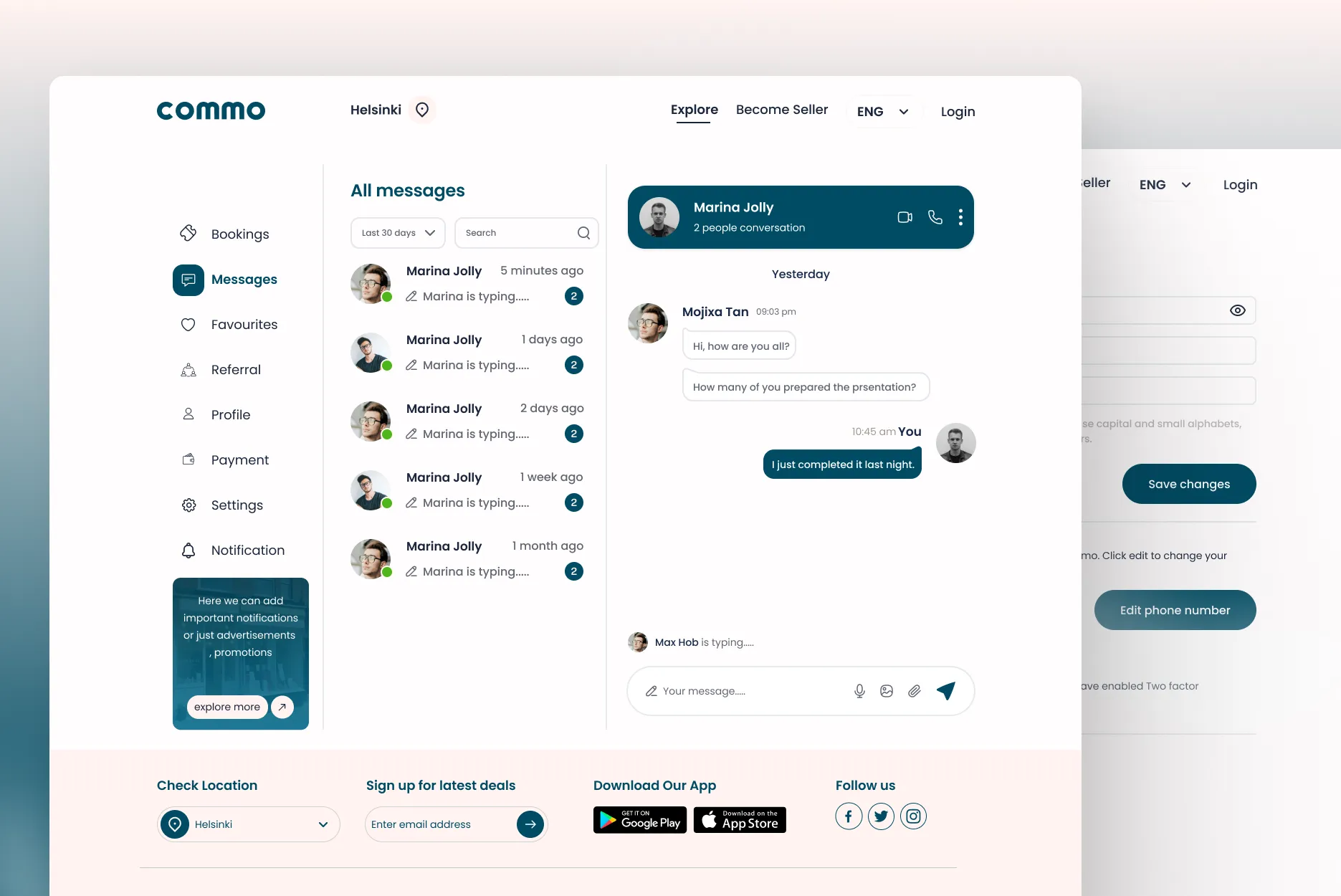
If repeated, I would introduce real-time chat between providers and users and integrate AI-based recommendation systems earlier.